The Humanities Do Matter

Humanities Matter 1
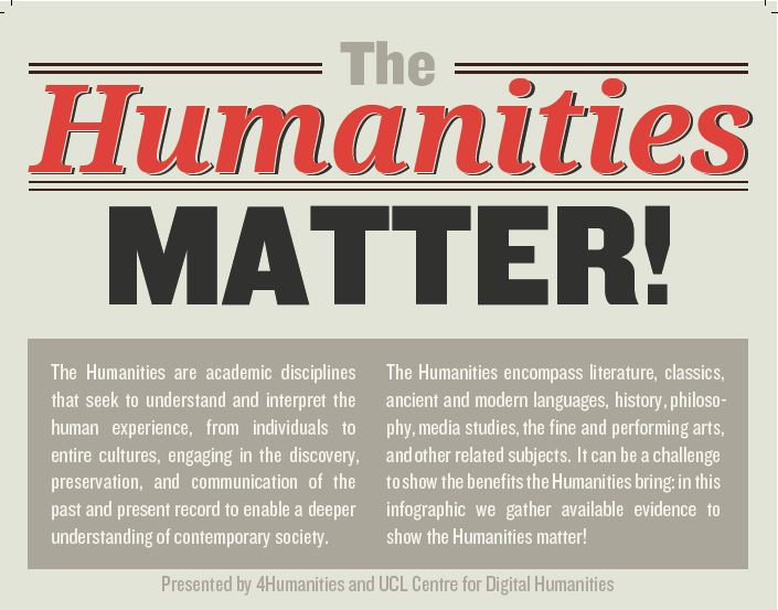
Screenshot from “The Humanities Matter!” by M. Terras, et al. 2013. Infographic, 4humanities.org/infographic.

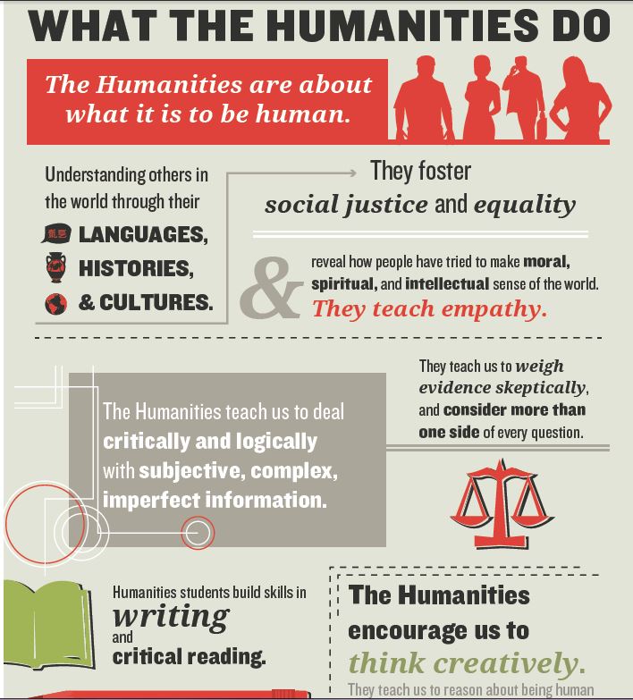
The good thing about all the doom and gloom over the so-called demise of the humanities is that it has caused humanities people to think about why the humanities are important and to quantify their place in our culture (see, for example, “Why English Majors are the Hot New Hires” by Andy Smith). One response to the “humanities is in crisis” debate comes in an infographic, The Humanities Matter!, from the University College London (UCL) Centre for Digital Humanities and 4Humanities.

The infographic visualizes statistics and arguments for the humanities, and some of the statistics might be surprising. For example, did you know that a “2012 survey of 652 US-born Chief Executive Officers and Heads of Product Engineering showed [that] almost 60% had degrees in the Humanities”? The entire banner, which has a Creative Commons license, can be downloaded here.

Imagine, for a moment, what it would be like if we did not have novels, poems, biographies, as well as film and television. All the things that examine and challenge our understanding of what it means be human. We might have poor imaginations, for one thing.

Without the humanities, I imagine it would be a little like living on Camazotz, the planet ruled by a big, bad brain called IT in Madeleine L’Engle’s A Wrinkle in Time. When Meg, Charles Wallace, and Calvin arrive on the planet for the first time, they encounter a neighborhood where all the houses look alike. That’s not so strange to them as is the sense that something is “off” about the children who are outside, skipping rope and bouncing balls. Charles Wallace figures out what’s wrong: “Look!” he says. “They’re skipping and bouncing in rhythm! Everyone’s doing it at exactly the same moment.”1   They quickly discover that people on Camazotz can’t think for themselves. They can’t make up stories or question anything. The humanities doesn’t exist on Camazotz. But when Charles Wallace gets trapped by IT, it is Meg’s stubbornness and her deep love for her brother that helps him escape. She realizes that these two things, which are integral to her humanness, are potent weapons against IT’s mind control.

Without the humanities, Albert Einstein might only have studied science and math. Imagine if he’d ended up in that patent office in Bern, Switzerland until he died, spending his whole life testing out other people’s inventions. Imagine if Einstein hadn’t been acquainted with the philosophy of Spinoza, which helped shape his understanding of order and determinism. How might that have altered his formulation of the theory of relativity? If Einstein had never learned to play the violin, how might that have affected his ability to arrive at E=mc2? How would he have relaxed his big, amazing brain? We don’t know these answers, of course. But, as humanists, we can speculate and imagine, “what if.” In fact, that’s what Einstein did. He asked, “What if the ether did not exist?” If he hadn’t asked that question, if he had assumed like everyone else that the ether existed, he might never have discovered the theory of relativity. The scientist and the humanist have many things in common.
Humanities Matter 2
Screenshot from “The Humanities Matter!” by M. Terras, et al. 2013. Infographic, 4humanities.org/infographic.

1 L’Engle, Madeleine. A Wrinkle in Time. New York: Farrar, Straus & Giroux. 1962. Pg. 103.

WordPress in the College Classroom: Five Sources

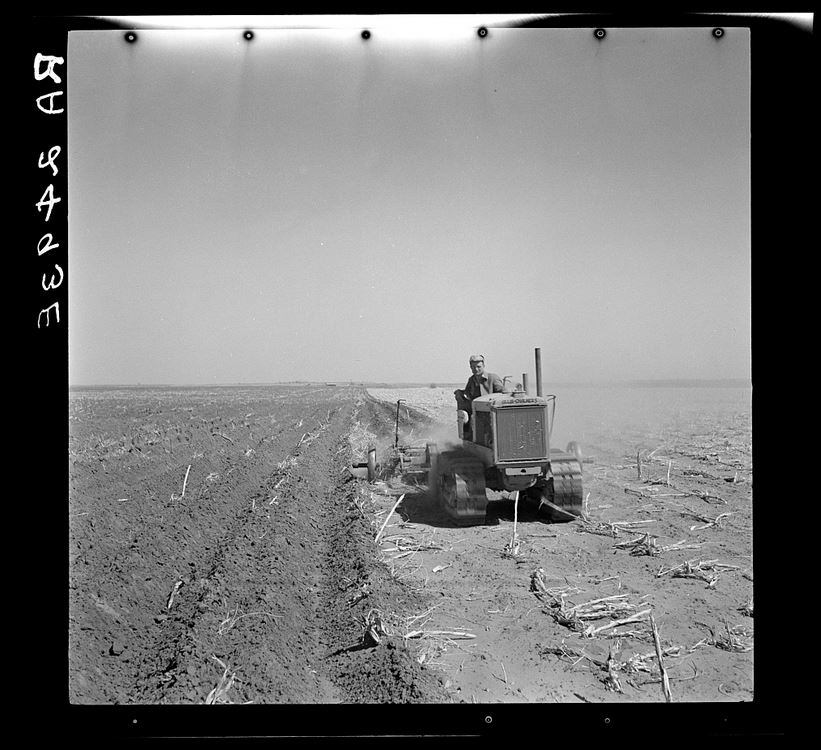
A Rothstein A Farmer LOC

Despite their membership in the digital tribe, few of my undergraduates have any experience with WordPress or any blogging platform. Using WordPress in my classroom gives students an opportunity to increase their digital literacy as they read and discuss works of literature.

Because to teach is to learn is one of my fundamental beliefs about teaching, I assign a small group of students to teach themselves how to use WordPress. They then teach their peers. Students also investigate the purpose and content of an academic blog, the pros and cons of student blogging, and then discuss their research with the class. My students use the blog to post short essays. They also use it to post abstracts of their final papers and links to online resources and projects they’ve created.

Here are five sources for using WordPress in the college classroom:

  1. WordPress for Teaching and Learning at Vassar College This slideshow was created for teachers by undergraduate seniors at Vassar. It contains examples of blogs in use at the college along with benefits and outcomes of using blogs in the college classroom. I especially like this piece of advice: “Emphasize WordPress as a discovery process.”
  2. Teaching WordPress: Building and Running Your Website on WordPress The pedagogical goal of this site, which is a resource for students at Portland Adult Education, is the same as the course’s title: “Create Your Own Web Site Using WordPress.” The site, created by a teacher named Frank, is well-organized and seems to have a little of everything you need to know to develop a site, from “Pages and Posts” to “CSS in 10 Minutes,” which can be helpful for tweaking themes.
  3. ScholarPress Courseware plugin should tempt anyone looking for a way to use WordPress as a learning management system. According to this Chronicle article by Ryan Cordell, the plugin can create assignments, schedules, and bibliographies inside of WordPress. ScholarPress recently received an NEH Digital Humanities Start-Up grant.
  4. Psychology in the News Nicholas de Leeuw, Dept. of Psychology, Vassar College, maintains this WordPress site. On the right-hand side of the screen,  you’ll find some pages offering guidelines for attribution, a checklist for blog post content, a discussion of comments versus posts, and other insights. De Leeuw emphasizes the importance of making original posts and comments, and offers advice on to how to create useful and original content.
  5. Using WordPress in Your Class for Student Writing and Websites is for teachers who have a WordPress site. Hosted by the College of William and Mary and created by Evan Cordulack, the site is a straightforward resource covering everything from adding students to a WordPress site to offering links to other instructors who’ve written about their experience using WordPress.

Image Info:
Arthur Rothstein. “A farmer listing his fields under the wind erosion control program. He receives twenty cents an acre for the work. Liberal, Kansas.” 1936. Library of Congress. Rights Advisory: No known restrictions. For information, see U.S. Farm Security Administration/Office of War Information Black & White Photographs http://www.loc.gov/rr/print/res/071_fsab.html. Reproduction Number: LC-USF34-002493-E (b&w film nitrate neg.) Call Number: LC-USF34- 002493-E [P&P].Medium: 1 negative : nitrate ; 2 1/4 x 2 1/4 inches or smaller.


Prezi: Zoom, Zip, and Stretch

If PowerPoint is a brick, Prezi is Silly Putty. Many people discover the presentation tool Prezi and never go back to PowerPoint.* What I like the most about Prezi is its versatility with graphics, text, and movement. Like PowerPoint, Prezi can create a linear presentation. But very often information is not, should not be, portrayed as being linear. Information and knowledge emerge from a web of connections and influences. Prezi allows a presenter to recreate and stretch that web and then hone in on specific strands.

Some creative people have learned how to maximize Prezi’s flexibility, and not just for oral presentations. They use it to create  stand-alone presentations of research, to visualize arguments, and curate collections of material. What follows is a variety of links I’ve collected that discuss and demonstrate Prezi’s potential.

The Journey of the Modern Thought Leader, created by Lulu.com, a self-publishing company, features bold graphics, carefully chosen text, and a smooth flow. It offers self-promoters basic but powerful tips for how to market him or herself in the digital age. This Prezi’s design reminds me of a slide show that’s been stretched and gently twisted, as it climbs up and dips down with each stop on the canvas. Toward the end, the presentation returns to a slide show format, when it moves from left to right to display four links for publicly sharing ideas. Though that shift might sound regressive, it’s not. Rather, the return offers a needed change of pace, surprising the viewer out of the established flow. The slide show format also distinguishes the concrete information–a list of links to Ted/TedX, Ignite, and related sites–from the rest of this Prezi’s content, which are ideas. Ideas, like the ones in “The Journey of the Modern Thought Leader,” follow a fluid path.

If You Put It That Way” by Leticia Britos Cavagnaro begins with the front page of a newspaper and ends with a wide angle view of a theater stage set. The newspaper frame (which is the equivalent of a PowerPoint slide), contains smaller frames. Like all the frames in this Prezi, the newspaper frame is embedded within the image of the stage. “If You Put It That Way” explains how to make a Prezi by way of example. It uses the combination of image, text, and movement–from a close-up detail to the large picture–to convey information and visualize it as a web of relations. One of Cavagnaro’s main points in this presentation is that our tools are metaphors for how we think. As Cavagnaro writes, metaphors “affect what we do” and our tools are metaphors for what we do, how we do it, and how we think. PowerPoint can only show one slide at time, moving forward or backward, forcing us into a linear thought mode. Prezi, on the other hand, offers an opportunity to break out of that limited movement: Zoom in. Zip out. Go diagonally. Enter layer upon layer of information. Open a portal and watch a YouTube video.

Students and instructors at the Bard Graduate Center for Decorative Arts, Design History, and Material Culture, use Prezi to curate materials. For example, “The Christmas Hearth” is a timeline that offers a “50-year cross-section” of Christmas cards with images of Christmas-themed fireplaces. On the x-axis is the decade and the y-axis contains types of cards, ranging from “motif” to “setting.” “The Christmas Hearth” reveals how these different types of cards waxed and waned in terms of popularity over time, thus demonstrating how Prezi can be used to visualize patterns. For example, the timeline shows that in the 1920s, people were more likely to send a calling card with a Christmas motif on it than people did in the next forty years. Different comparisons between the cards can be easily made because it’s possible to see the whole collection in one big gulp or in smaller groups.

Prezi has spawned resumes. Someone has dubbed his a “Prezume.” The challenge with this genre is to use Prezi not as a gimmick but to add something about a job candidate that a regular resume cannot supply. Prezi is most useful when information and design (content, arrangement, and movement) can be combined to convey meaning about someone’s expertise and qualifications. To that end, though I think the Prezume is very clever, it’s difficult to get a whole picture idea of that job candidate. On the other hand, this sample Prezi-based resume does a fairly good, if bland-looking, job at keeping the standard categories of a resume intact and allows viewers to zoom in on specifics, including samples of work. Finally, here’s a Prezi that combines a teaching philosophy with work experience to form a visually stunning resume, one that clearly reflects the candidate’s expertise at storytelling, teaching, and design.

Prezi’s motto is “Ideas matter.” They do, and as some of these examples demonstrate, they are.

*I wanted to find a link in favor of PowerPoint over Prezi. When I googled “powerpoint is better than prezi,” most of the top hits were on the subject of why Prezi is better than PowerPoint.


“Teaching Digital Writing” Conference and Workshop at Bard IWT

At the 2013 Institute for Writing and Thinking Conference and Workshop, held at Bard College, I believe I was the lone tweeter. Given that the conference title was “New Kinds Attention: Teaching with Writing in the Digital Age,” I was a tad surprised. But only at first. Many of the conference participants, made up of K-12 teachers and college professors, were new to digital writing. Others were using technology in their courses, but often with resistance and even resentment. I arrived to the conference expecting to discuss with others strategies for digital writing and planned to leave with new techniques and ideas, but that did not happen. Instead, I learned a great deal of first-hand information (much of which should be familiar to anyone who reads about education) about how teachers are contending with technology, from everything they like about it (SMART Boards) to what they dislike (unauthorized use of devices in the classroom; the tools change too quickly to be mastered). The experience gave me insight as to how to better work with people, whether a student or a teacher, who are skeptical or hesitant to try new technologies for writing projects. I plan to expand on those ideas in a future post. Below is a collection of tweets I made, mostly during Cynthia Selfe’s talk, “New Kinds of Attention: Teaching with Writing in the Digital Age.”

Technology and the Liberal Arts Student

Cedar Key Foods, 2013. Cedar Key, FL

Whenever an article appears about the importance of exposing college students to technology, I cringe on behalf of the university at which I teach. My school has many strengths, including a terrific service-based learning program, strong academics, and funding  for undergraduate and graduate research, as well as for faculty. However, we have no basic technology literacy requirement (see, for example, the requirements at Cal State), and no one expects most students to do much with technology, except for using BlackBoard. Some instructors at my school do use digital tools in the classroom in highly creative ways, often without support from either IT or the administration. But I’d wager that the majority of students–grad and undergrad–graduating this year don’t know how to give a presentation using anything other than PowerPoint. The reasons for these conditions are complex, and establishing a commitment to integrating technology into our research and teaching cannot happen over night.

To remedy this situation, I’ve voluntarily taken a leading role on campus to create learning opportunities for using technology to professionalize, research, and teach. These events are well attended by faculty, staff, and students, and are supported with funding and encouraging words from participants and the administration. People think I’m a “digital humanities” expert, but everything I know about that and engaging with technology in diverse ways has been my own doing. I’m almost entirely self-taught and am still learning. Fortunately, I’m surrounded by some amazing people at my school and the New York City area who use technology to do humanities-based work. I soak up a lot from them.

The inspiration for this post and what made me cringe with frustration was the Chronicle of Higher Education article, “Colleges Must Prepare for a Buyer’s Market.” In it, Jeffrey Selingo proffers questions colleges should be prepared to answer if they wish to attract top students. One of those questions is “How tech-savvy is your institution?” The answer, writes Selingo, is to

forget about whether your college gives out iPads to all incoming students or whether the wireless network covers every square inch of the campus. Students will want to know how you’re using technology to change the way courses are delivered. Be prepared to say how many professors mix technology with their lectures so they can be viewed outside of class, or whether students have an option to choose from a variety of course formats: face-to-face, hybrid, and online. A few potential applicants might even ask about “adaptive learning” software, which personalizes the learning experience so that students focus valuable class time on what they don’t know and breeze through what they have already mastered.

Selingo is right. My school offers few of the options he cites, aside from a small online program.  But as my comments above indicate, his emphasis on the way teachers use technology to deliver course content is only part of the answer. Students will (or should) want to know how they will be trained to be versatile users of technology. They will want to know if they will be taught how to build, evaluate, and use technology effectively, whether for a composition class or an advanced history course. Maybe that does mean handing out iPads to everyone. As many have argued, it’s not about just owning the tool, it’s what you do with it.

Obviously, there’s no iPad-For-All program at my school. But for my composition class this year, I requested a room with computers. My students have used them to collaborate on small projects in the classroom. They’ve written articles together for the class wiki and created Infographics to visualize competing arguments. Together they’ve explored Scrible, A.nnotate, and, of course, Zotero. The computers also offer an opportunity for me to work with them one on one, to help them learn how to search the library databases for their individual research topics. So far, I’ve enjoyed teaching this composition class more than any other.

My teaching methods are designed in part to pre-professionalize my students. William Pannapacker stressed in a recent New York Times article that college students’ professional careers and future stints as graduate students essentially depend on being savvy users of technology. In my composition and literature classes, I lead my students to a big pool of ideas (see also Bamboo DiRT) about using technology for reading, writing, research, and discussion, and basically force them to jump in. Most discover that the water is warmer and more fun than they expected. A former student from a literature class recently thanked me for introducing her to Prezi, WordPress, and other digital tools. She explained that they had been useful in her current classes and that she had helped her father design a presentation for his work, based on the skills she’d learned my class. It was nice to get the feedback, but it also illustrated to me how deeply behind the times my school is in terms of preparing its students for the future. My student shouldn’t have had to thank me for introducing these low-barrier, entry-level digital tools into the course. She should have expected me to expect her to know how to use them. And so I cringed today.